Not saying too much
 Geico
Geico
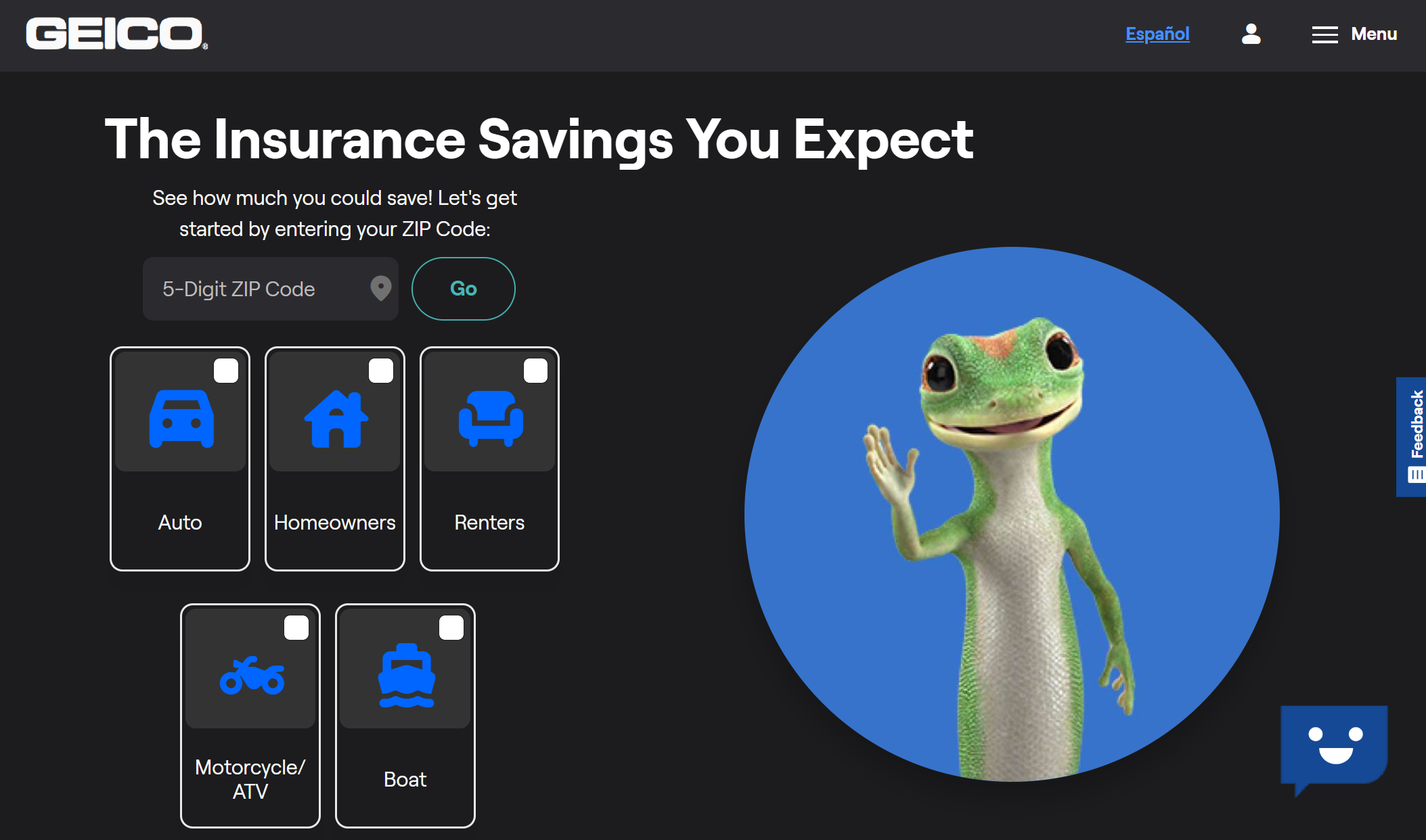
Geico's website is very to-the-point and minimal, all the sections on the page lead to eactly what the user could want. Even the colour palette is very minimal, with only a few graphics as it's against a black background with buttons to show where a user needs to click to exppand into Geico's components. The buttons are highlighted and bolded, and are the only points of colour on the entire page. There is very little introduction as well, it's just to the point for what a user might have come for and very efficient.
Writing Outwardly
 UTD
UTD
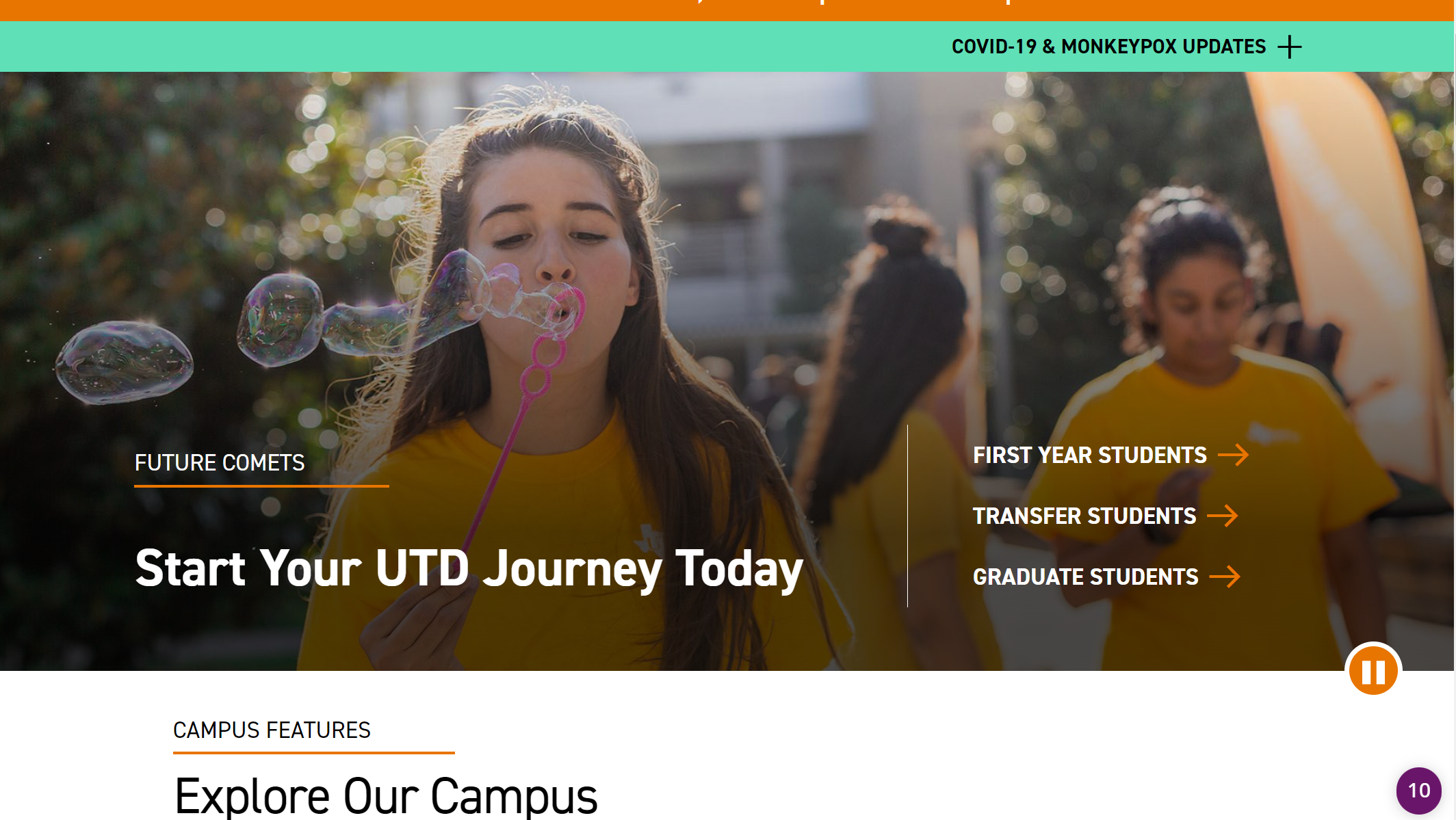
The UTD website starts of with strong writing and second person pronouns like "your" and "you." This helps immediately put the focus on the user visiting the site that assumes they're already ready to sign up. The forward writing is also bolded and in bigger text, to draw attention from the user as they scroll down. There's many more intances where they use this to encourage users to start on different parts of the page like signing up for clubs and events. It also feels motivational, as if they're cheering the user to go through with signing up.
Burying the Lead
 Ulta
Ulta
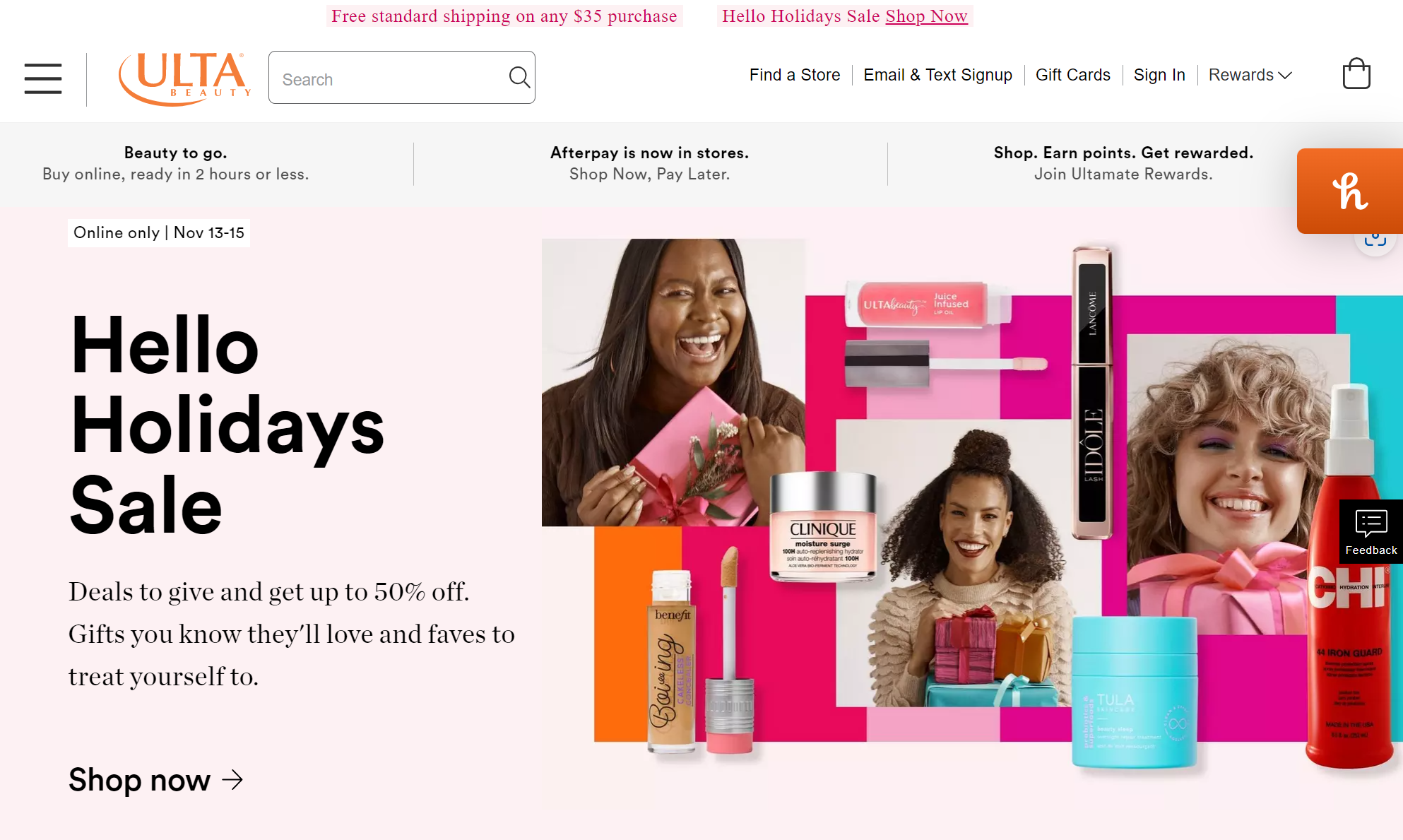
In the Ulta screenshot, the newest deals are in a large heading the moment a user enters the website. Right under is a giant shop now button that when clicked, leads to that main deal in an easily identifiable way. This is to encourage users to immediately go to where they need, which is to shop at Ulta using their holiday deals, and encourages users to click on it without a second thought. The logo about the deals is to the point and snappy, so it immediately catches your eye even if a user just glances on it before clicking the shop now button. It's quick and convenient.
Strong Call to Action
 Hulu
Hulu
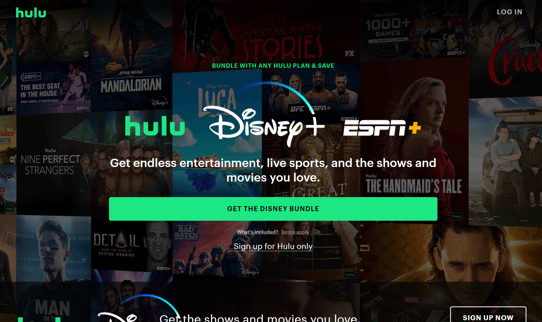
Hulu has an incredibly strong call to action. It's very simple but catches the user's eye immediately. It showcases some of the selection of shows Hulu offers in the background for an immediate glimpse into what a user may want to watch, while having a simple snappy slogan under large names of companies with their subscription in order to remind the user what other things they might be looking for. The large green button then highlights the disney bundle in case a user wants to access disney-- which Hulu knows is a big drawing point-- or reminds the user that they have such a bundle in the first place. Underneath, while smaller, is a sign up link so the user can start a hulu account as soon as possible in order to access their variety of shows. It sells it subconsciously while also just reminding users to sign up.